Yummly Search Redesign
Using an established design system to redesign the search experience on the Yummly app.
The problem
Prior to the redesign of the search experience on Yummly, users frequently identified the search experience as a source of friction when attempting to interact with the app.
1. Inconsistent visual language
Due to technical and design debt incurred before the implementation of a design system, legacy features are still implemented using outdated and inconsistent visual treatments.
2. Lack of agency for users
The search functionality lacks features that allow users to retrieve previously searched recipes, enabling them to resume their search from where they left off.
3. Poor usability to refine searches
The search refinement filter is difficult for users to find, lacks certain usability considerations, and is visually cluttered.
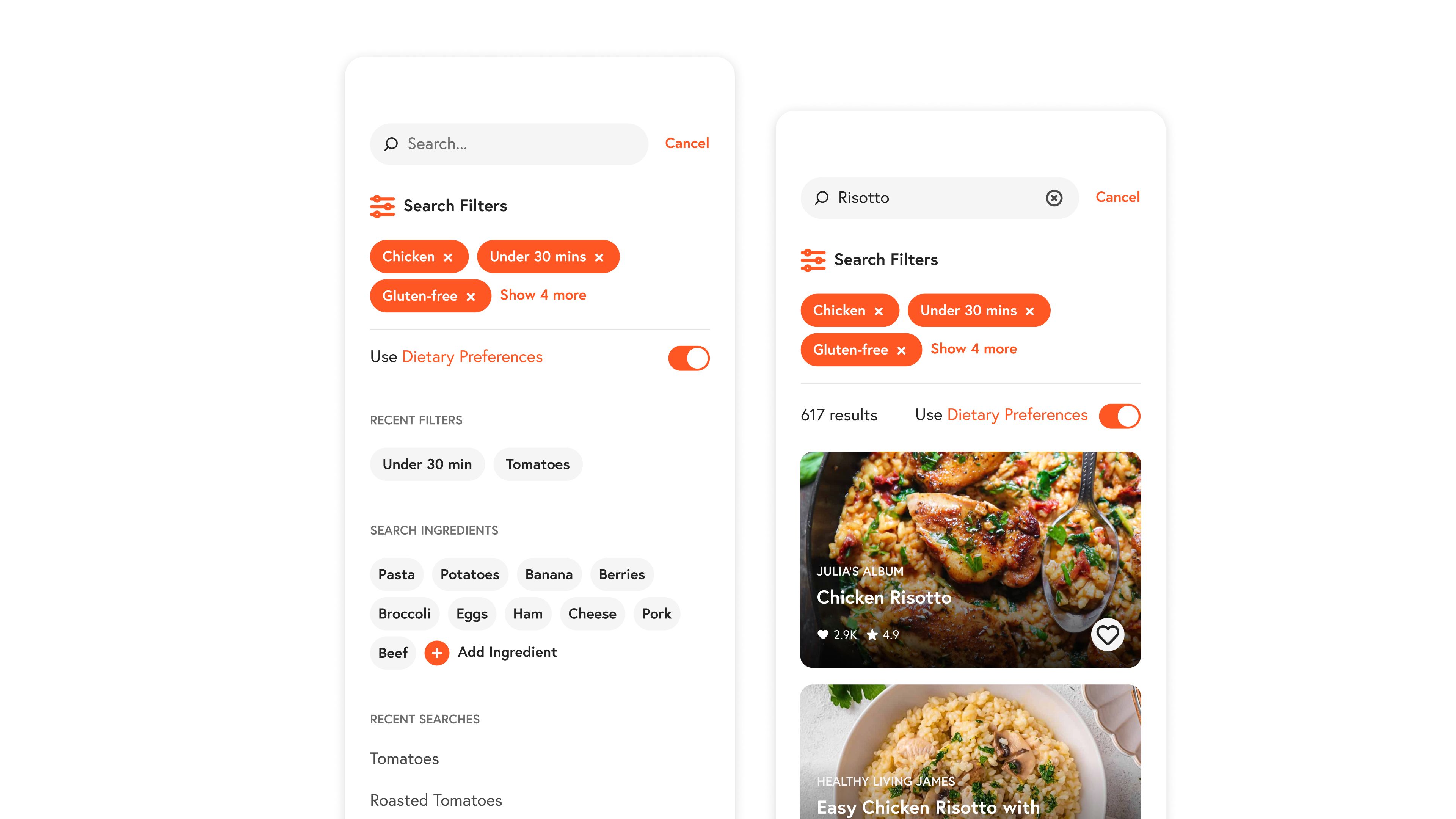
Leveraging the inherit visual consistency provided by a design system.
Using Yummly’s Pasta Design System and component libraries provided a built-in solution to address the issues of visual inconsistencies. Color, typography, and hierarchy rules are all defined and were applied to this legacy feature.
Users now have enhanced control over their recipe search experience by enabling them to apply filters prior to initiating a search. Additionally, users gain access to their recent search history and any recipes they have previously interacted with.
Conclusion
By simply applying the established design system to core parts of the search experience we were able to fix the issues with visual clutter and inconsistencies. Its a simple win for designers and engineers alike.
Utilizing some already established components in the design system we were able to fix the issues regarding the usability of the search feature, giving more agency to users so that they can quickly find the recipe they want to cook.