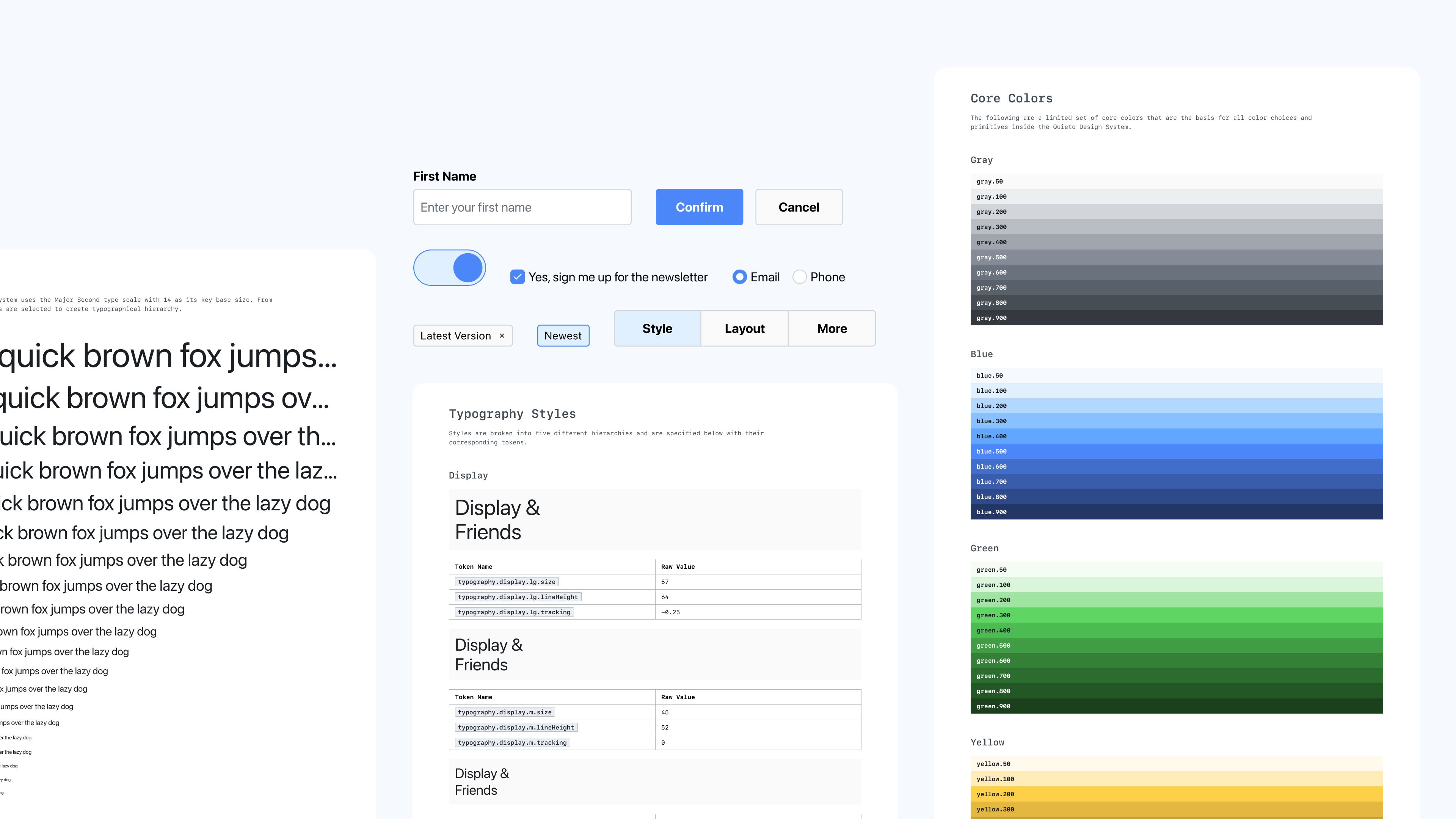
Quieto Design System
The Quieto Design System is a token-based design system started as a personal project to help me build other side projects more quickly.
The problem I wanted to solve with this project
When starting a new project I found myself spending more time planning, designing, and building the basic UI components such as buttons and inputs over and over again. This ate into valuable time that could have been spent building out the actual project. To get around this, I initially thought using an established component library would help. This worked briefly, but I quickly found that some of these libraries were opinionated in their styling, making it hard to override those styles to match what I had designed in my mockups. I knew that creating my own reliable components was the direction I needed to go.
What should this design system provide for me?
Setting out on creating a personal design system I knew that I needed it to accomplish two things:
- Establish a cohesive look and feel
I wanted to create an initial “brand” to any future side projects to help me stay consistent with design choices I’ve made at a global level. - An opportunity to explore new tools
I wanted this design system to be a vehicle for me to dive into new tools for the creation and management of design systems. Design systems are always changing, so this could be the perfect opportunity to explore methods that I wouldn’t necessarily have in a larger organization.
Introduction to Quieto
“Quieto” translates to “quiet” or “subtle” in Spanish. I wanted to base my design system off these ideas. To achieve this, the brand needed to have understated colors, relying more on a neutral palette for default styles. I also wanted to use the native platform font stack, creating a familiar and more performant experience for the end-users. I also wanted to have available the most basic UI elements that are a must-have as components to both designers and engineers. There are three dimensions to the Quieto Design System:
Tokens
Quieto’s lightweight brand is delivered using a token system. Using Amazon’s style-dictionary package, I manage the tokens through a central source of truth repository that is distributed to a Figma Library of Primitives and as an installable package through NPM. This token package is actually installed as a dependency for this very website!
Figma Component Library
Using the token system, I created a Figma component library that I can import into any project to help me go faster with ideation and feature concepts. I again emphasized with this library that I only wanted to define and create the most basic UI elements.
React Component Library
Using the specifications from the Figma Component Library, I have also started a React component library that will be distributed as an installable package through NPM. This is currently a work in progress