Pasta Design System
Pasta is a token-based design system developed by myself and the design team at Yummly to improve the overall efficiency across the entire organization.
The problem
Before the creation and implementation of the Pasta Design System, Yummly was facing inefficiencies with its processes of maintaining and expanding the product.
1. An inconsistant experience
Having to maintain the experience across three platforms (iOS, Android, and web) became inefficient.
2. Incorrect brand voice
The brand look-and-feel began to lack cohesion between all platforms.
3. Development effort
Lack of reusable UI elements lead to a bloated and hard-to-maintain code base.
Solution and approach
A token-based design system called Pasta.
With a design system, designers and engineers can more smoothly participate in the product strategy by documenting design choices and decisions, creating a shared source of truth for the entire organization.
Why tokens?
- Yummly designers can abstract their choices, such as spacing, sizing, and color as reusable constants inside of their design files.
- Tokens can also be used to manage brand assets and decisions, such as color palettes, themes, and typography.
- Tokens can be efficiently shared with developers from a source of truth, so that designers and engineers are speaking the same language.
Atomic structure of Pasta
Inspired by the Atomic Design Principle, Pasta is separated into three categories.
Primitives
Designer choices abstracted as tokens and reusable constants inside of our design tools.
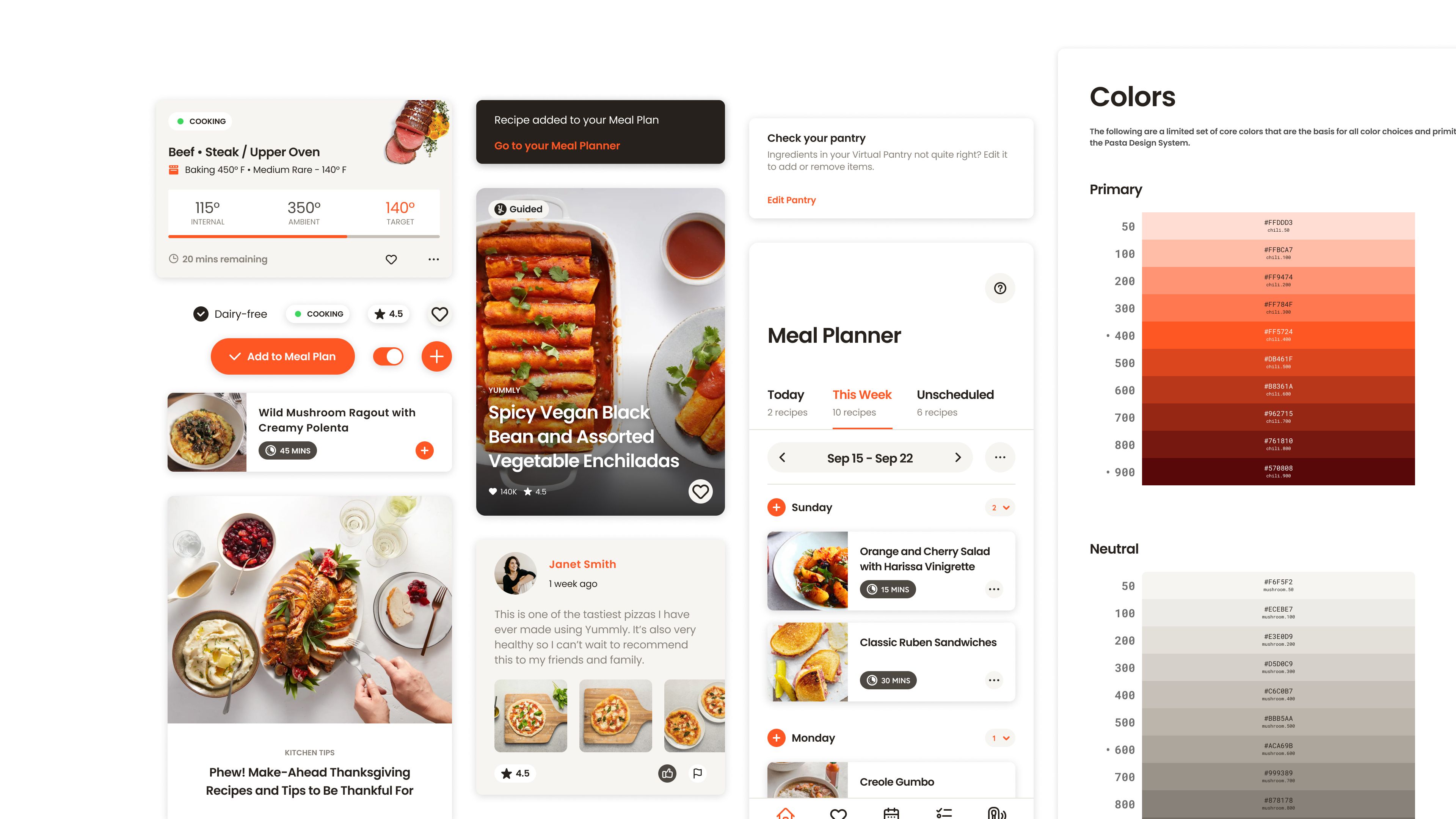
Color
Colors were broken up into two distinct palettes: the core palette, and the semantic palette. Each palette has a specific hue index by the tint for shade value. Gradients were also specified as a color primitive.
Typography
Typographic styles were based off of a minor third scale to help create a harmonious rhythm and to create a clear hierarchy in all text styles.
Spacing and sizing
Spacing was set based upon the typical 8 point grid system, meaning every spacing/sizing value is divisible by 8. This is helpful to create standardized space and visual rhythm.
Elements
The basic interface building blocks, such as buttons, text input, and form elements. Elements took into account the primitives and tokens to construct their form.
Patterns
An interface that combines Primitives and Elements to create more complex interactions. This encompassed most of the UI elements in the Pasta design system.
Knowledge base
The Pasta knowledge base served as a documentation source for the entire organization. I would maintain the site, updating information such as token references and specification documentation.
Handoff and developer collaboration
While creating a token-based design system was relatively a no-brainer, the real challenge was getting the rest of Yummly staff to utilize Pasta. I knew that buy-in from the engineering teams would be essential to have a successful design system, so having open dialogue between designers and engineers was essential. I established biweekly meetings between four of our key stakeholders: the lead iOS engineer, the lead Android engineer, the lead web engineer, and myself. These meetings consisted of discussions around the strategy behind how each platform would implement their own component libraries, the design specifications of UI elements and patterns, and demos of each other’s contributions to the design system.
Conclusion
The introduction of the Pasta design system eliminated duplicated efforts that fostered a lack of congruence with design standards from designers and engineers.
Designers now have a component library where they can pull elements and patterns from a central source of truth, avoiding inconsistencies.
Engineers now have a source of truth to reference for the building and use of their respective component libraries, reducing repetitive and hard-to-maintain codebases.
With designers and engineers being more efficient, Yummly as a whole has become a more efficient and agile organization that can develop and implement new features much faster.